react-md v6 is out now 🎉
New Features
Box Component
This is probably one of the most useful components to be added to react-md. The
Box component is a wrapper around the CSS box model for
display: flex and display: grid and can be used to implement most of the
DOM structure or layout without custom styling.
With the introduction of the Box component, the
Grid,
GridCell,
GridList, and
GridListCell components have been removed. See the
Material Grid Example for an example
using the Box component.
Latest Material Icons and Material Symbols support
All the available icons can be found using the new Material Icons and Symbols page.
The @react-md/material-icons package has been updated to support the latest
material icons but only through SVG icons. To continue using font icons, either
use the new MaterialIcon component or the FontIcon component.
Material symbols can be used through the new MaterialSymbol component
that supports customizing the weight, grade, and optical size globally,
for a section of the app, or one offs.
Autocomplete usability
If you've used react-md in the past, you'll probably know that the
Autocomplete "worked" but wasn't user friendly or useful. With this version
of react-md, the Autocomplete has been remade to improve the user experience
by acting more like an editable Select component. So the Autocomplete
is more in line with the react-select and the
material-ui Autocomplete.
Here's a quick summary of the new changes:
- The default behavior requires a valid option to be selected and will reset to the last valid option or an empty string
- Multiple values are now supported with optional inline chips or checkboxes
- Circular progress bars are now supported
- The selected option and input value can both be controlled
- The component API should hopefully make more sense without the
getResultLabel,getResultValue, ... whatever I was doing before - More type safety
Check out the new Autocomplete demos to see more!
Improved Alert, Toast, and Snackbar API
The toasts and alerts have been updated so toasts can be shown from anywhere
instead of only within React components with the useAddToast hook. Toasts
can now be created by importing the new addToast function.
import { Snackbar } from "@react-md/core/snackbar/Snackbar";
import { addToast } from "@react-md/core/snackbar/ToastManager";
import { StrictMode } from "react";
import { createRoot } from "react-dom/client";

import "./index.scss";

createRoot(document.getElementById("root")).render(
  <StrictMode>
    <Snackbar />
  </StrictMode>
);

// doesn't need to be called from react components!
window.setTimeout(() => {
  addToast({ children: "Hello, world!" });
}, 3000);
Some other new features for snackbars and toasts are:
- supports the theme colors
- allows configuring the visible time on a per-toast basis
- the toast timeout pauses while the user hovers the toast
- multiple toasts can be rendered at once
- new customization through a custom toast renderer prop
Check out the new snackbar demos to see more!
Better dark mode support
The dark mode has been improved so that the interaction states are now visible by default when switching to the dark mode. The following images show the normal, hover, then focus states for a button with the dark theme enabled.
Before:
After
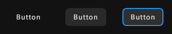
As you can see, the hover and focus states could not be seen by default in previous versions but now will automatically use the background inverse color to apply the correct styles.
Other native elements like the <select> should also update based on the dark
mode color scheme.
Simplified Slider and supporting marks
The Slider component has been simplified and now only requires a value and
setValue to use. Due to these changes, the RangeSlider is no longer
required and has been merged into the Slider component.
In addition, the Slider component now supports rendering marks below to help
show where specific values are within the range.
Overflow Only Tooltips
Tooltips now support being shown only if there is overflow text. Check out the Overflow Only Tooltip demo for more information!
New responsive CSS util
A simple objectFit utility function has been created for
styling images, videos, and other media types. This should be able to replace
most of the MediaContainer / ResponsiveItem usage in your app with better
styling behavior.
New Tab Component Features
The Tab components have been updated to support:
- scrolling with buttons instead of the hidden scrollbar option that existed before
- being rendered vertically
- maintaining a consistent tab panel height using the new useMaxTabPanelHeight hook
Tree Expansion Mode
The Tree component has been updated with a few new customization options like
the expansionMode which allows the child
tree items to only become visible after clicking the icon instead of anywhere
in the tree item.
Circular Progress and Linear Progress Colors
The CircularProgress and LinearProgress components now support the
primary, secondary, warning, success, error, and current-color
themes.
Class Name Utility Functions
Most components now expose a class name utility function to provide styles without
using the component itself. The naming conventions are to use a
camelCasedName instead of PascalCased. For example:
buttonfor theButtoncomponentexpansionPanelfor theExpansionPanelcomponenttypographyfor theTypographycomponent
In addition, a general cssUtils helper has been created for common styling.
Test utils with jest and vitest
New polyfills and test utils are now provided that integrate with jest and vitest to improve testing. Check out the testing quickstart guide on how to get started.
New Components and Hooks
A few new components and hooks have been added:
- AsyncButton
- CircularProgressSuspense
- ColorSchemeProvider
- ClickableCard
- ErrorBoundary
- HighlighText
- Mark
- Navigation
- NoSsr
- NullSuspense
- RenderRecursively
- RootHtml
- SegmentedButton
- SkeletonPlaceholder
- Slide
- StickyTableSection
- TooltippedButton
- WindowSplitter
- useActiveHeadingId
- useAsyncFunction
- useCSSVariables
- useInlineCSSVariables
- useCarousel
- useColorScheme
- useDebouncedFunction
- useElementSize
- useHtmlClassName
- useIntersectionObserver
- useMutationObserver
- usePrefersDarkTheme
- useReadonlySet
- useResizableLayout
- useStorage
- useTableOfContentsHeadings
- useThrottledFunction
- useWindowSize
Improvements
Documentation 🎉
The documentation site has been remade to hopefully improve finding information with the following changes:
- Navigation is based on component, hook, or feature instead of package.
- Examples and demos have been trimmed down to focus on a single feature and file at a time. There are a few more complex examples near the end.
- Most examples and demos can be edited and previewed within the website instead of needing to create a codesandbox
- The code editor theme can be configured in the global settings menu
Checkbox and Radio Icon Styling
The Checkbox and Radio components no longer use some hacky CSS to overlay
the checked icon state to show the unchecked state. Instead, both icons are
rendered and toggled using CSS and the :checked state allowing for easier
customization.
CSS Variables are visible through CSSProperties
If a react-md component is imported that uses CSS variables, the variables will now become visible and type-checkable with typescript when defining inline styles.
import { Avatar } from "@react-md/core/avatar";

function Example() {
  return (
    <div
      style={{
        // no longer a type error!
        "--rmd-avatar-color": "orange",
        "--rmd-avatar-border-radius": "0.5rem",
      }}
    >
      <Avatar>A</Avatar>
    </div>
  );
}
No more layout shifts while enabling scroll lock
The new scroll locking behavior prevents layout shifts by calculating the current scrollbar size and applying padding to the root element. This can drastically improve performance for apps that rely on resize observers to position content.
Lower CSS specificity
The styles have been re-written to always have the lowest CSS specificity allowing custom styles to override react-md with ease.
Use :focus-visible instead of .keyboard-mode
The :focus styles for almost every component now uses :focus-visible
instead of relying on .keyboard mode &:focus removing the
UserInteractionModeProvider requirement from these styles. If the previous
focus behavior is desired, set core.$disable-focus-visible to true
The id prop is no longer required
All react-md components that required an id now default to
useId() and can be omitted.
SSR Rehydration
By enabling a new ssr mode in the
CoreProviders, temporary components like dialogs
and overlays will remain visible and mounted after being rendered on the server
until the first time they are unmounted.
In addition, the general layout has been updated to handle SSR behavior better by relying on media queries for switching between layout types instead of only requiring javascript. Check out the new layout documentation for more examples.
React StrictMode and 19 Support
Every StrictMode error has been fixed
and react-md is ready for React 19. The documentation site has been using the
React 19 RC for a long time without
issue. In addition, it is now possible to prevent the entire app from being
marked as a client boundary when importing a component from react-md. Each
component and hook has been correctly marked with the "use client" directive
as needed.
Shared Portal Node
The Portal has been updated to render all content within
a <div id="rmd-portal-container" /> by default instead of the document.body.
This allows quick access in the dev-tools to inspecting portal elements and
preventing any issues that might appear for rendering additional nodes in the
document.body.
Improved dev build times
With the migration to ESM, the @react-md/core package has been created to
only support importing from specific paths instead of a
root barrel file.
This will improve development speed as bundlers will no longer need to fetch
all files within react-md to begin compiling.
The base react-md package will still support a root barrel file import if
this is not a concern.
-import { Card, CardTitle } from "@react-md/card";
+import { Card } from "@react-md/core/card/Card";
+import { CardTitle } from "@react-md/core/card/CardTitle";

 // ✅ This still works, but will result in slower dev builds
 import { Card, CardTitle } from "react-md";
Better Dev Tools Support
In prior versions of react-md, inspecting CSS variables could be difficult
because they were split into multiple rules without using postcss plugins.
Starting with react-md@v6, custom properties will automatically be grouped
together in the devtools.
Before
Click to see full image

After
Click to see full image

Slightly Smaller Bundle Sizes
The gzipped sizes have decreased slightly with the latest version of react-md:
- Javascript: 92.51 kB to 82.77 kB
- SCSS: 18.08 kB to 16.55 kB
- NOTE: This was the smallest theme bundle with
$primary-color: $grey-500,$secondary-color: $red-700,$color-scheme: lightfor both version of react-md
- NOTE: This was the smallest theme bundle with
Breaking Changes
There were a lot of breaking changes, but a few will be called out here specifically.
ESM and new Sass modules only
react-md will now only support ESM going forward since most build tools already
support it. In addition, the legacy @import syntax is no longer supported for
Sass.
Get started with react-md v6
Ready to upgrade to react-md v6? Head to the v6 migration guide next.